THE SPOTLYTE
Destigmatizing Medical Aesthetics
WHAT IS SPOTLYTE?
In 2017, the biopharmaceutical company Allergan, worked beside BCG and Alexandra Wilkis Wilson to build out three digital ventures in the medical aesthetics realm. For those reading who aren't familiar, Allergan is the creator of Botox, Juvederm, Coolsculpting and SkinMedica.
Spotlyte is a platform designed to engage readers with a breadth of interviews, treatment guides and offers. Readers can live chat directly with experts to get their questions answered, all for free. At Spotlyte I worked as a creative partner with other teams including Engineering, Editorial, Social, and Marketing. Wins include building an atomic design system, editorial reading experience, conversion experiences, and treatment guides.
THE PROBLEM
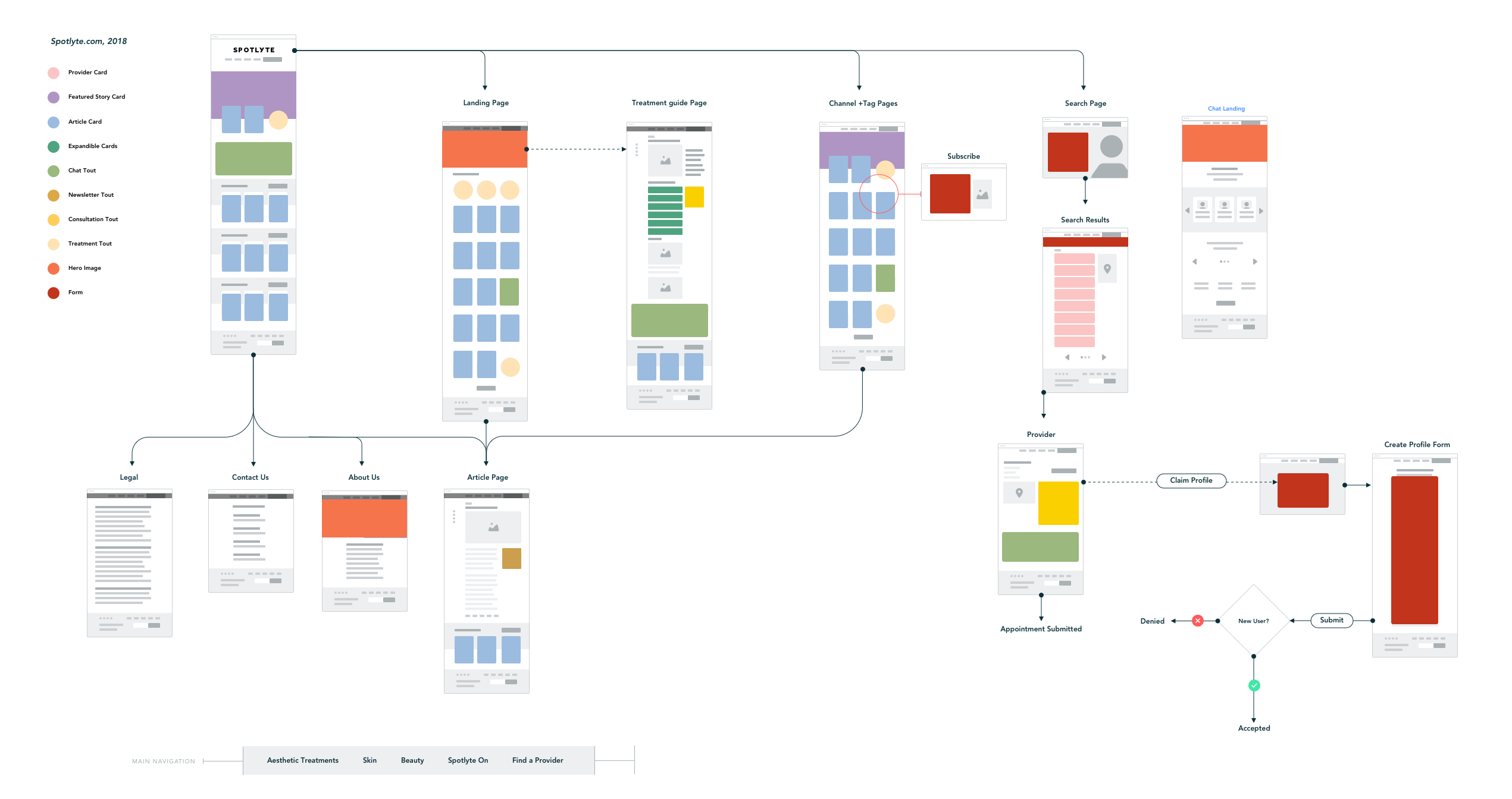
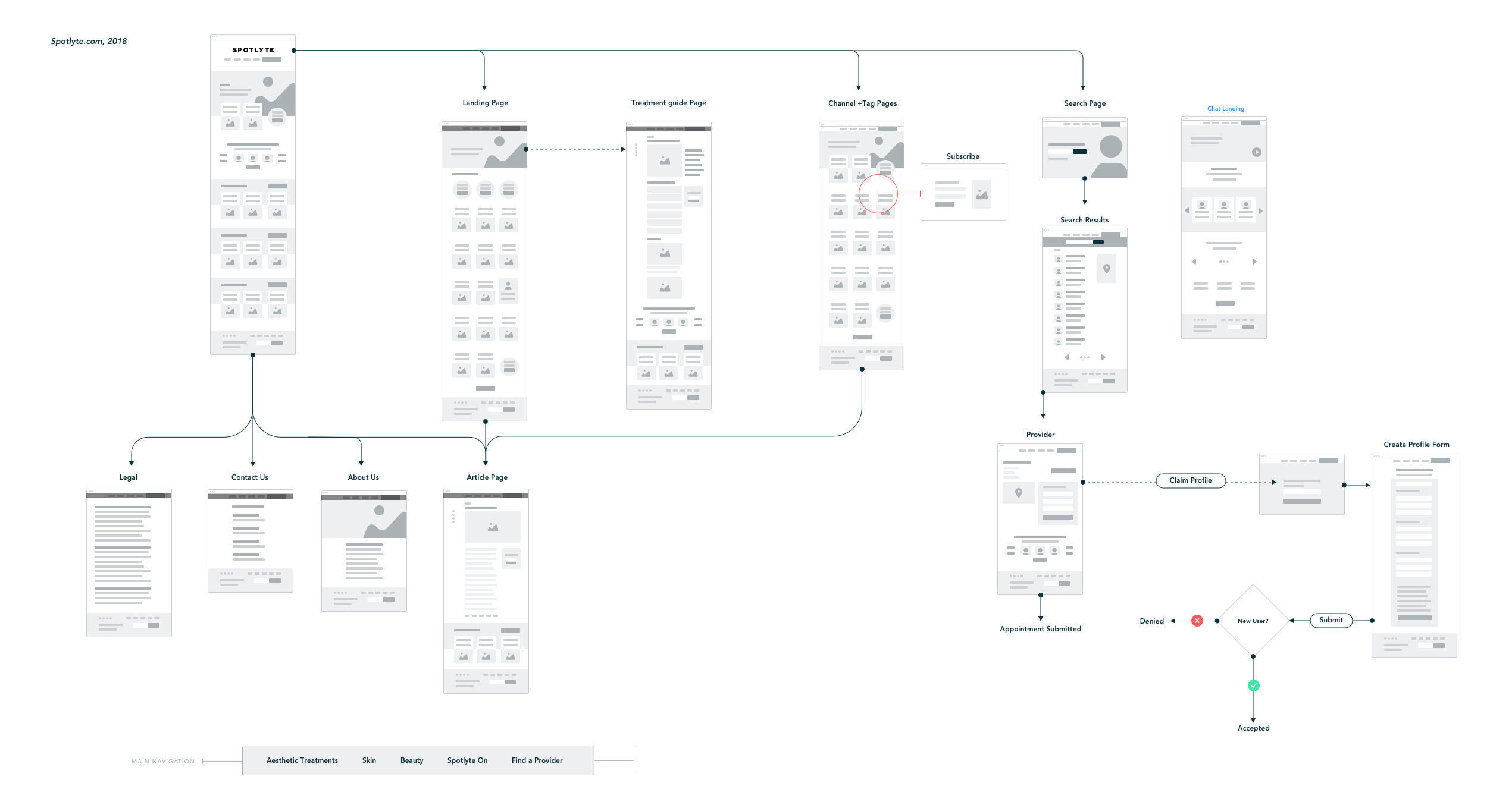
In the beginning, Spotlyte inherited a site that lacked consistency from a brand, experience, and engineering standpoint. We saw this as an opportunity to tune-up the website's architecture and build a modular system of atoms, components, and organims.
In building this system we were able to build faster, learn about our user's needs, and organize our code base from an engineering perspective.We began by doing an audit of everything on the existing product.
WHAT WE FOUND
Legal language, which is an integral part of what we do, is not considered within our existing design system.
Articles, treatment guides, expert interviews, ecommerce longforms, and provider profiles all use the same template.
90% of our traffic is mobile, but there is no variation on the mobile experience.
Arbitrary UX paridigms are peppered throughout the experience (i.e. expandible cards, unnecessary friction)
We are an unbranded site. We have the luxury of no ads.
ATOMIC SYSTEM
With everything considered from a user and buisness perspective, we tuned-up the system.
Atoms
Grid
Image Ratios
Iconography
Logos
Motifs
Color palette
Typefaces
Texture
Animation
Content
Elements
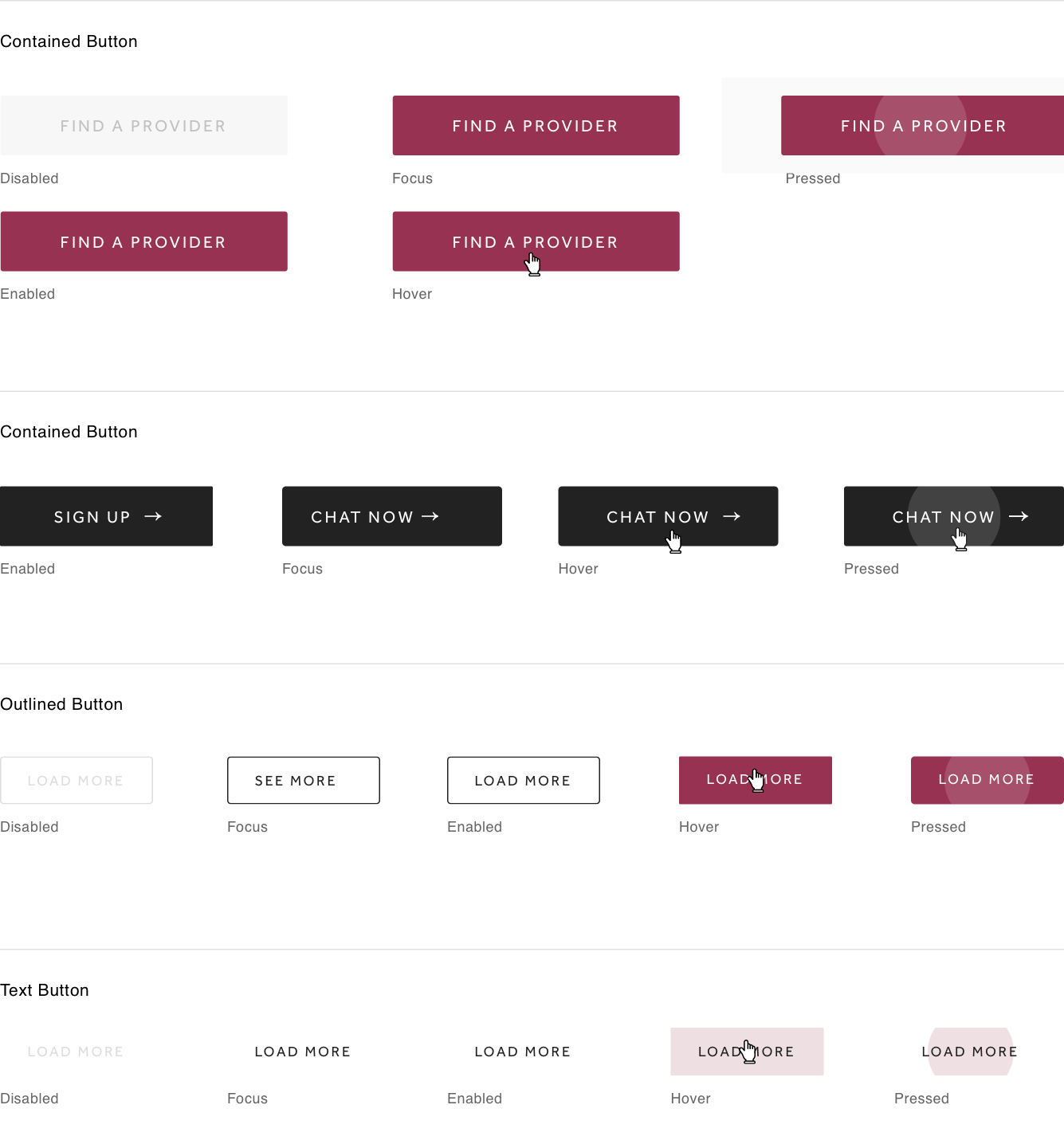
Buttons
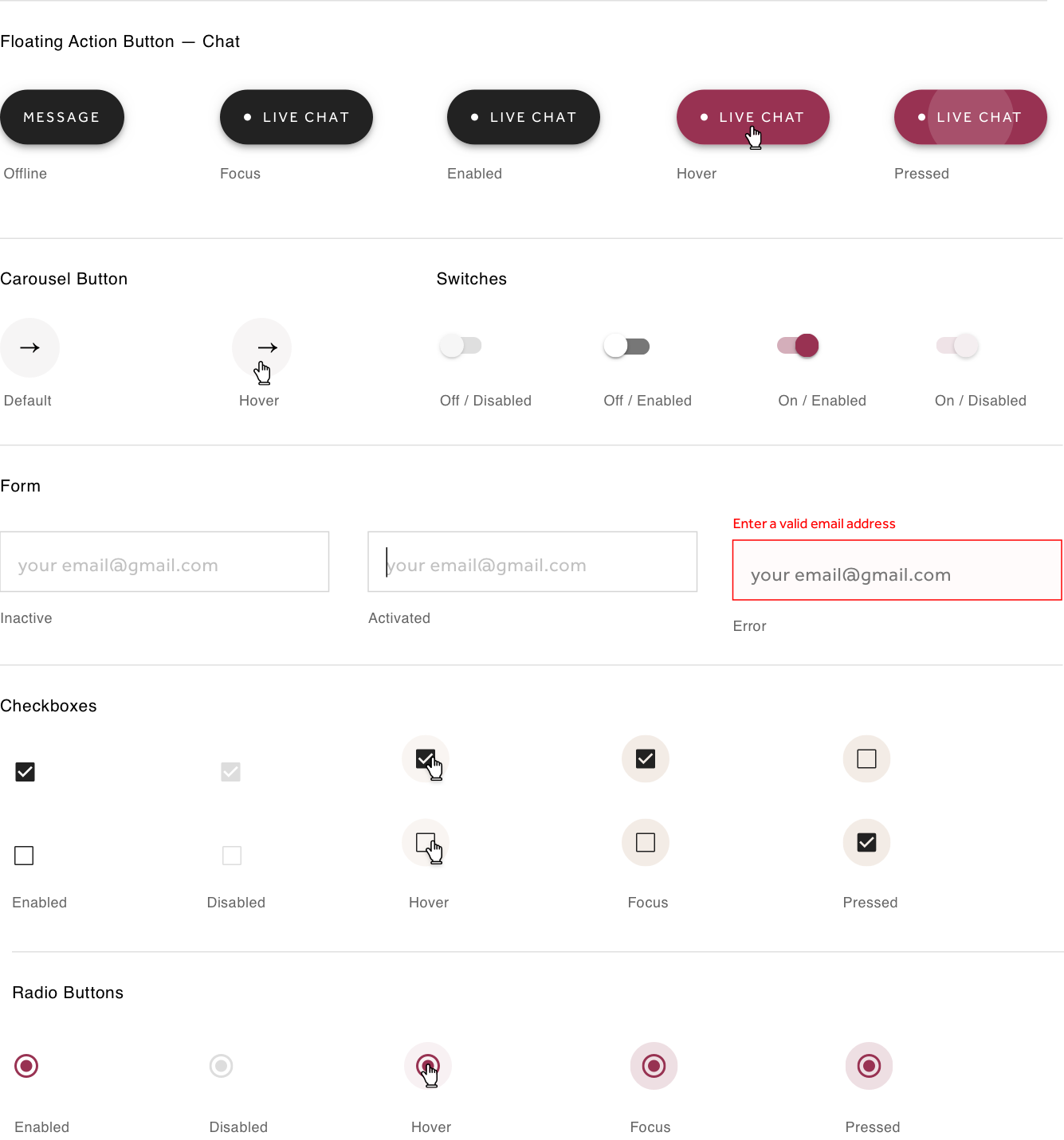
Forms
Selection controls
Dropdowns
Social Lockups
Components
Navigation
Footer
Article cards
Chat touts
Treatment touts
Offer touts
Article hero
Treatment Hero
Patterns
3 cards
2 cards
6 cards
Templates
Homepage
Treatment guide
Longform article
Product listicle
Interview article
Treatment review
Tag page
Provider profiles
ELEMENTS
Global interactive states
COMPONENTS
Aesthetic Treatment Guides + Touchpoints
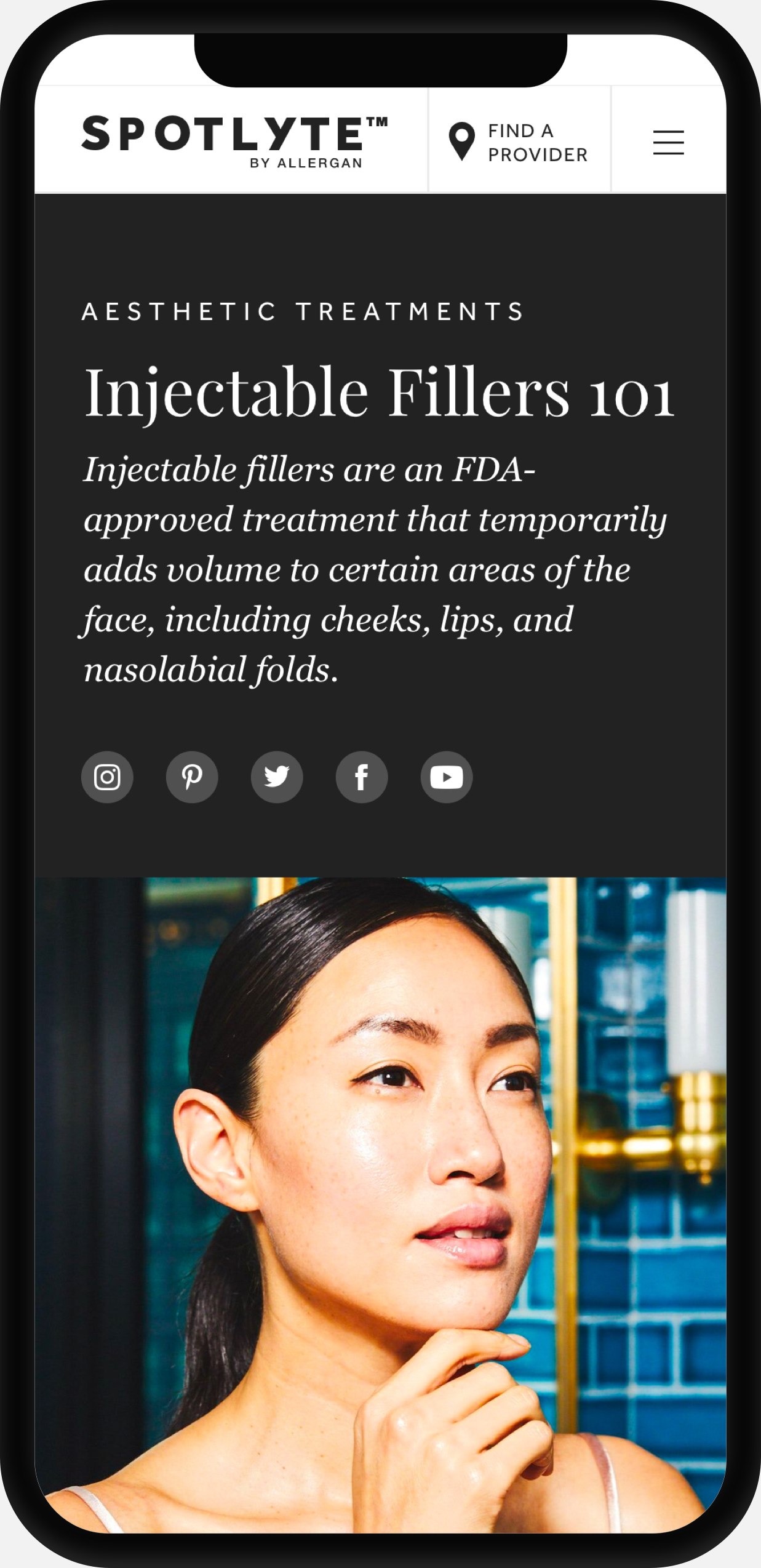
Hero Block
Frames the page as an educational guide, as opposed to a lengthy article.
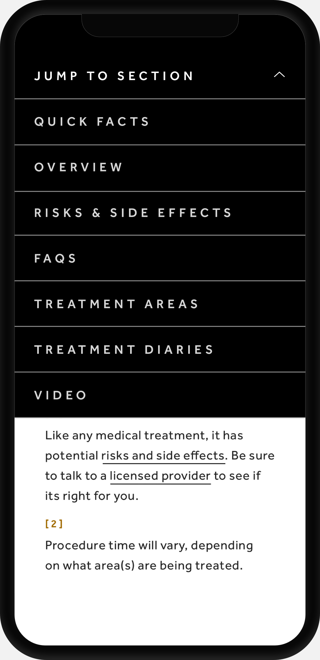
Secondary Navigation
A clickable index that allows the user to jump sections.
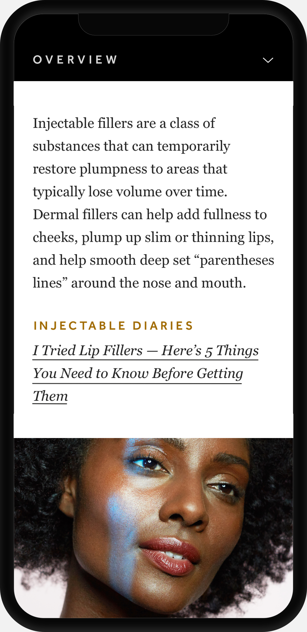
Overview
Messaging that is integrated into the native reading experience
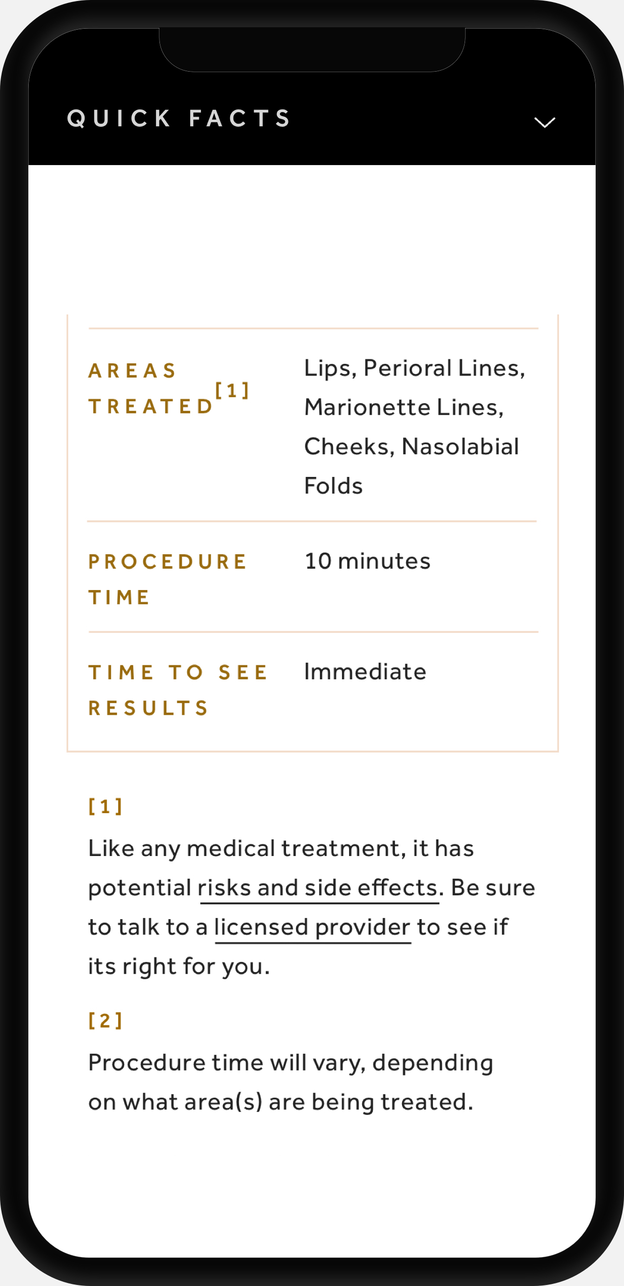
Quick Facts Chart
Bite sized grid highlighting the users' top questions.
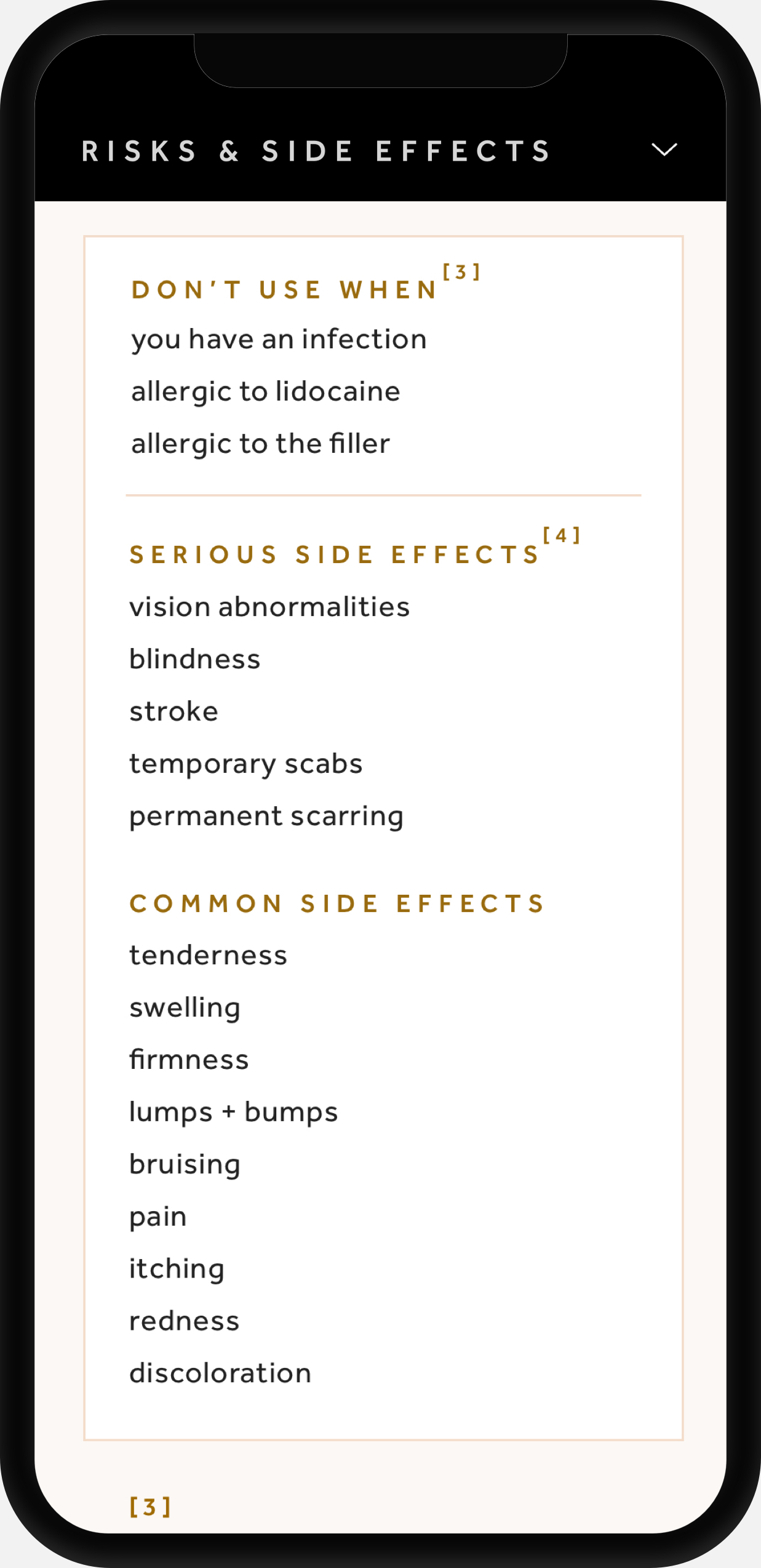
Risks + Side Effects Chart
Purposefully Integrating legal requirements into our system.
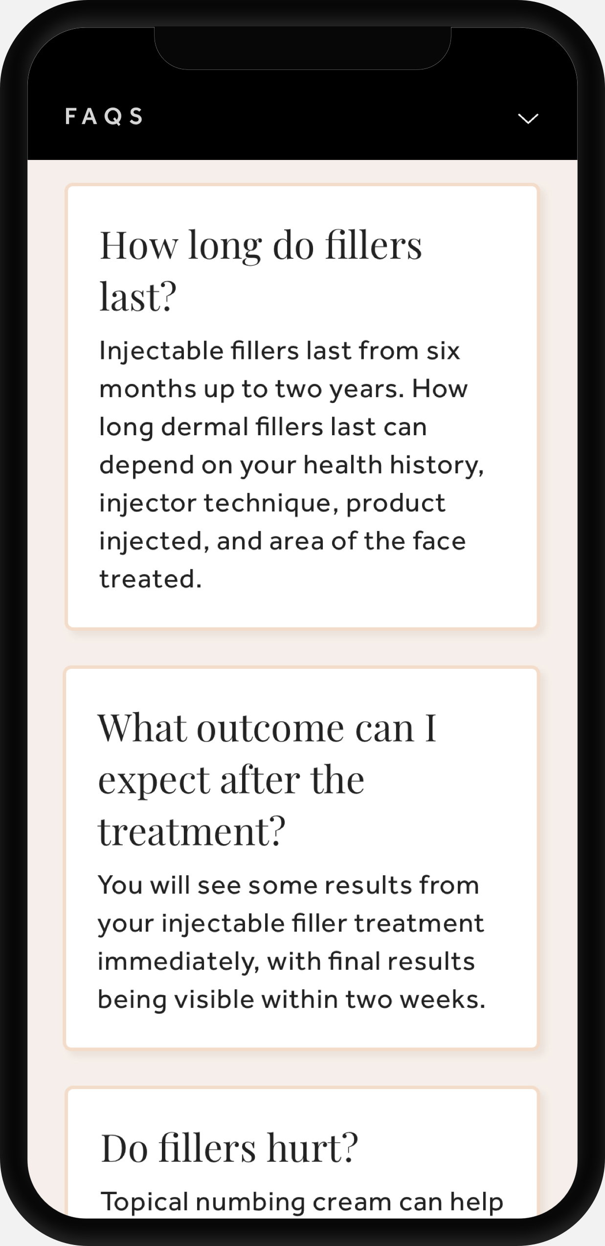
Treatment FAQs
Reworked frequently asked question cards.
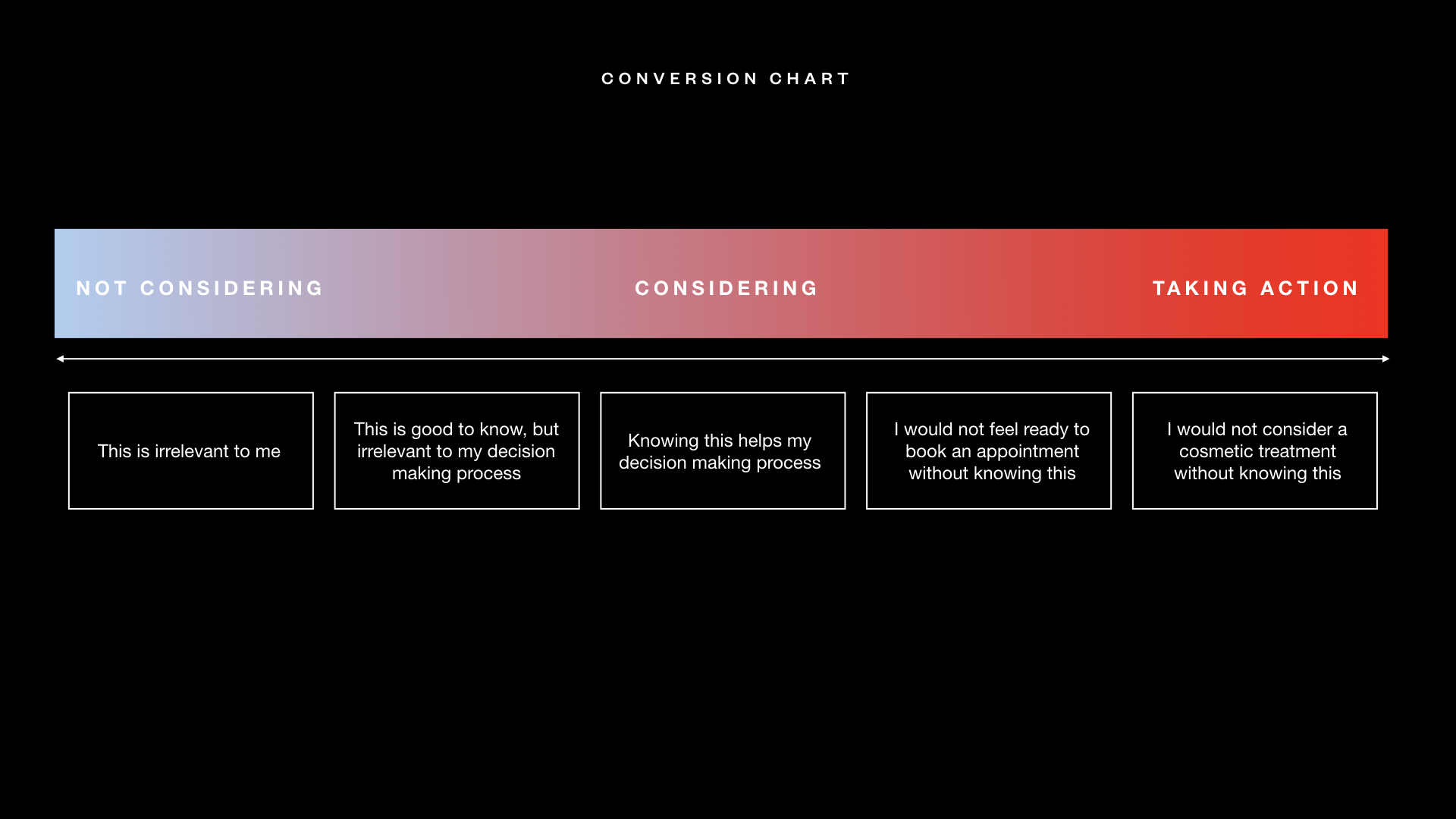
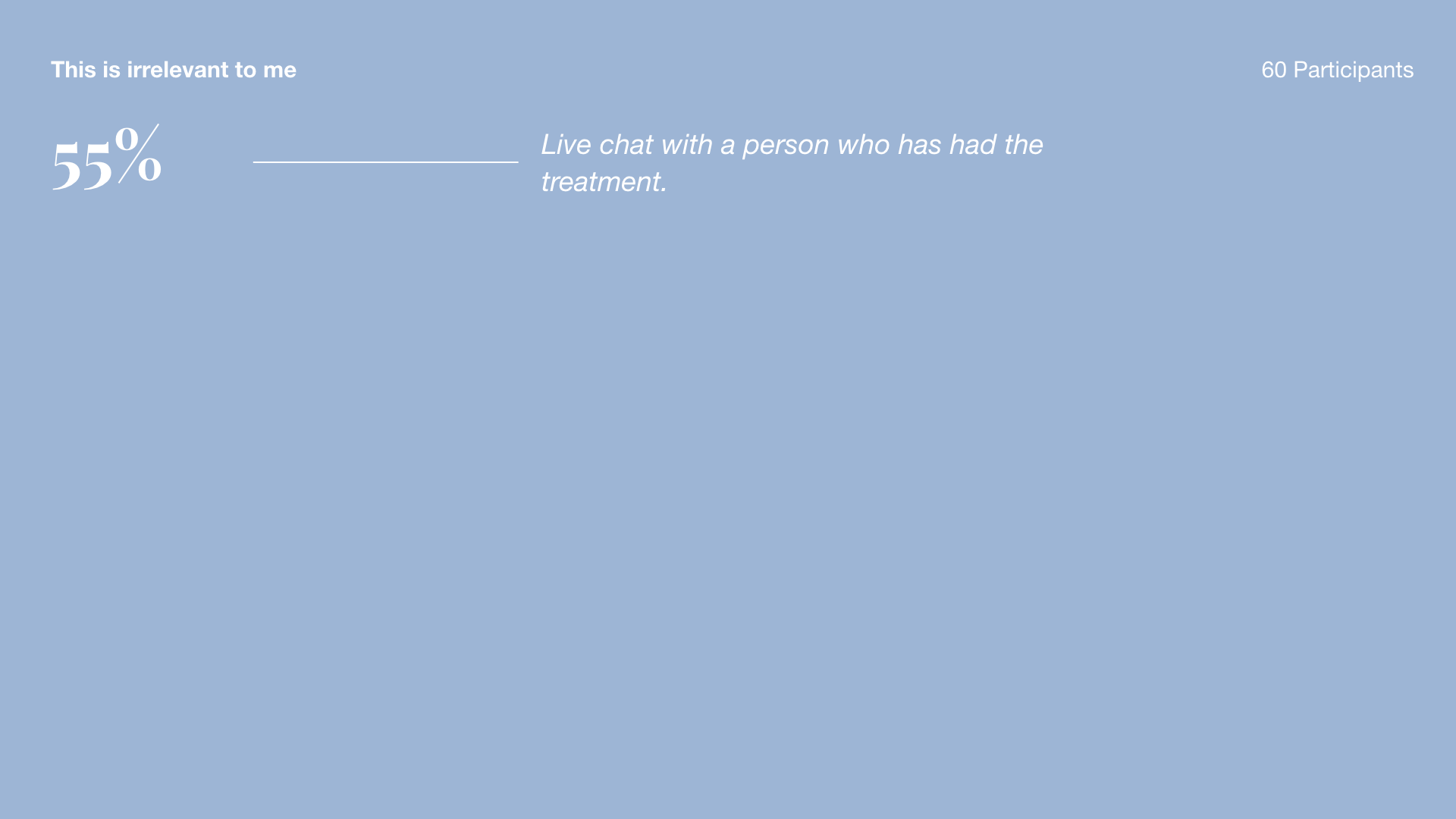
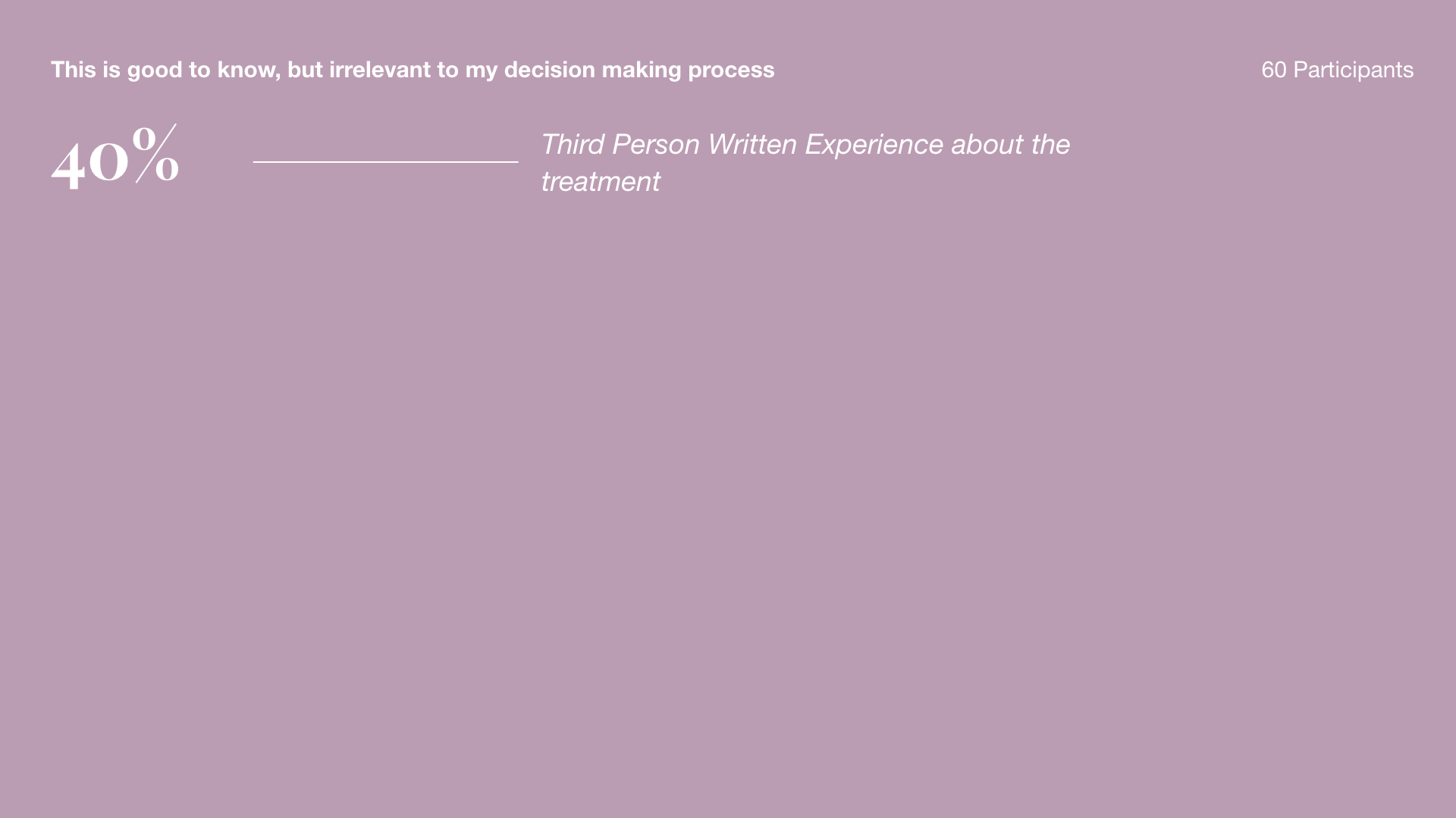
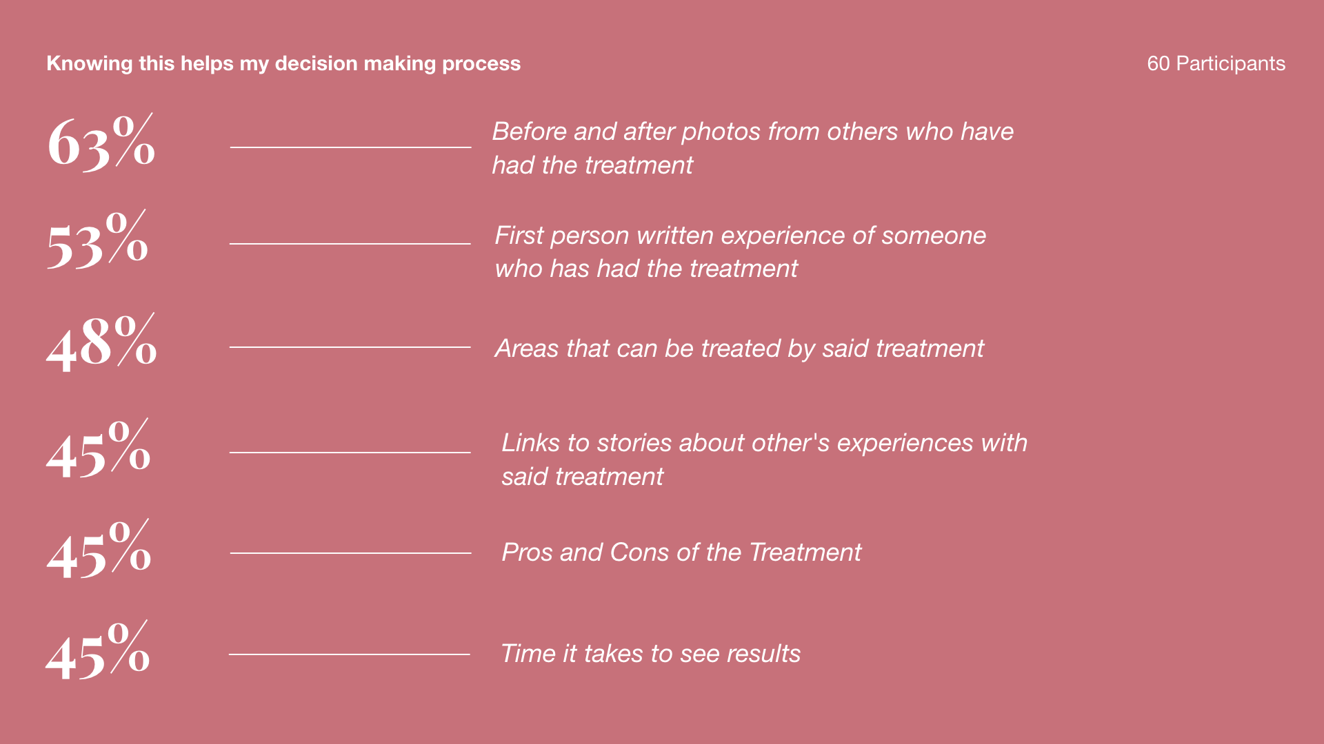
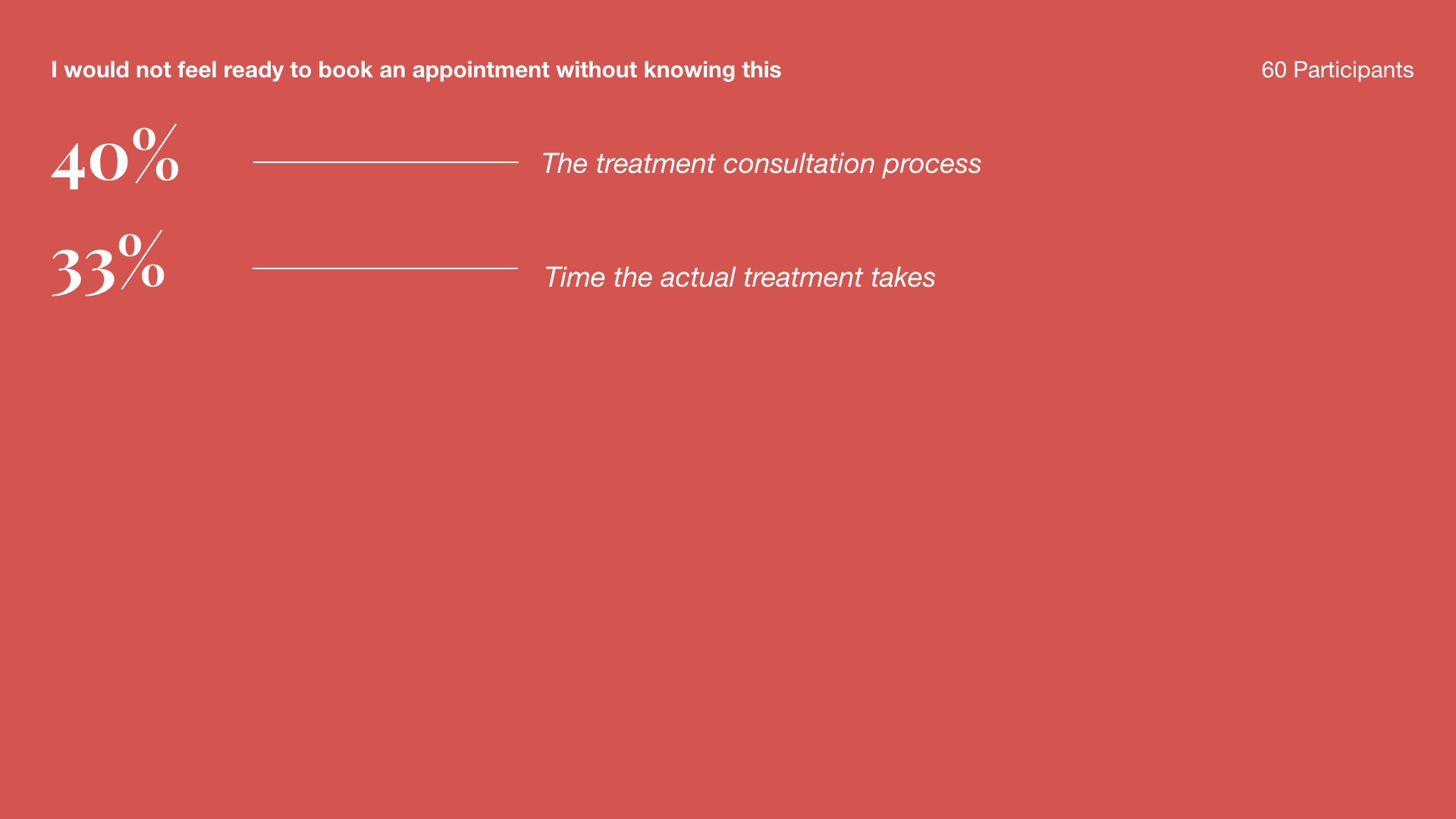
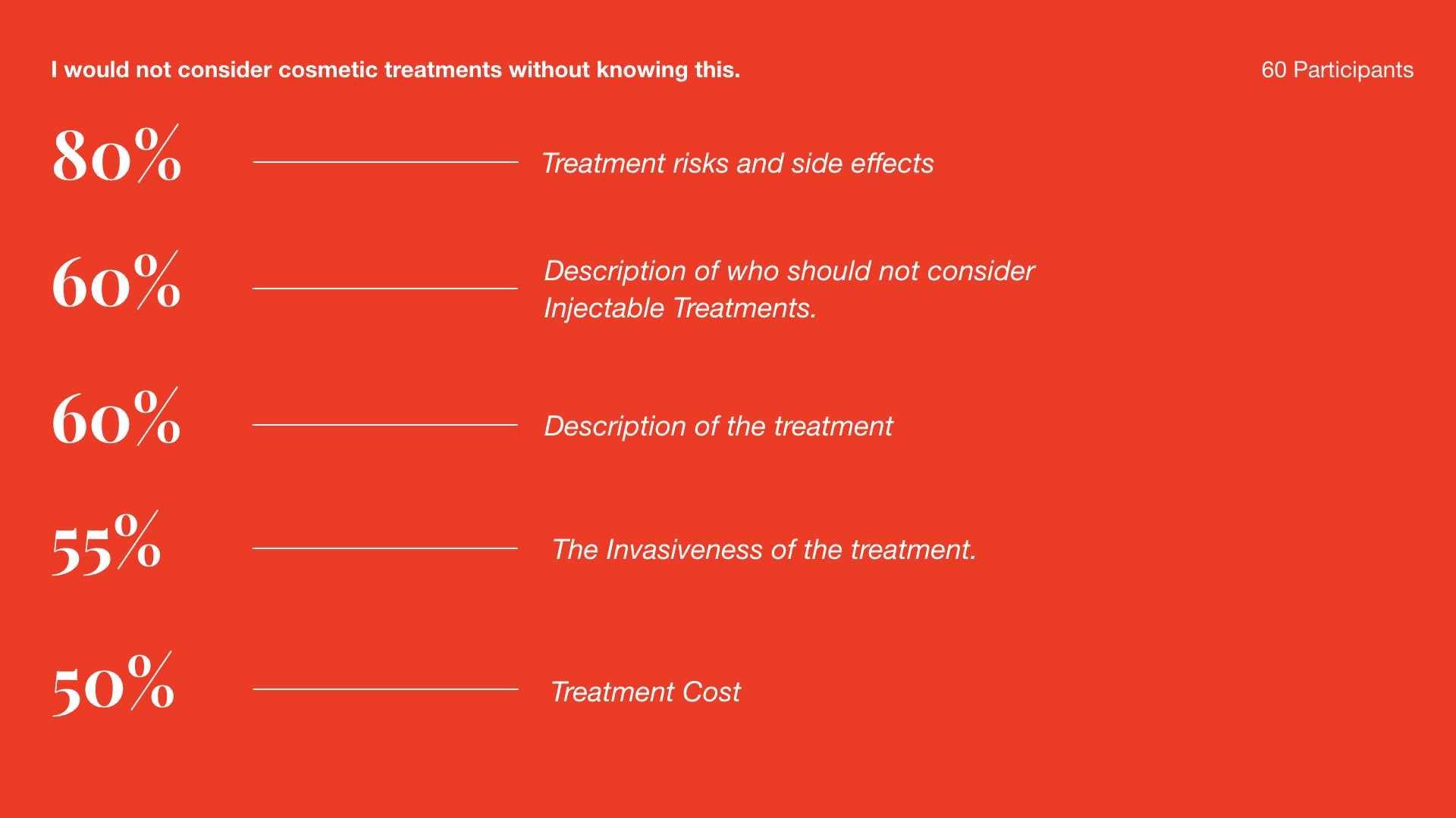
CARDSORTING EXERCISE
What information causes users to take action and book a consultation? What information is irrelevant to them?
THE OUTCOME
2.5m
Revenue over the course of 15 months.
900
Percent Increase in signups via campaigns.
5.5m
Pageviews over the course of 15 months on over 400 articles.
67k
Loyal customers + organically returning users
