PRODUCT SYSTEMS
Vanity Fair & Wired: Gated Content Model
THE PROBLEM
Over the past 10 years, editorial print magazine sales have unfortunately been diminishing. Revenue numbers show that ads, branded content, affiliate links, and commerce is NOT going to sustain these beloved brands. From a business standpoint it became clear that we needed to look at other revenue opportunities.
The first Condé Nast brand to implement a content paywall was The New Yorker. TNY's loyal audience and unique content proved the gated article strategy to be successful. In the process of migrating to a new workflow and CMS, we saw this as an opportunity to build a flexible system that all brands could use, starting with Vanity Fair + Wired.
THE PROBLEM
Marketing lacks brand and product input.
Order forms are outdated and confusing.
No foundational styles exist on the website.
EXPERIENCE PRINCIPLES
First impressions aren't just impressions.
Provide value before asking for something.
Build trust with consistency.
Heavy handed marketing tactics, poor ad implementations, and bad UI could scare away readers who would otherwise become paying customers.
Be mindful of what it means to disrupt the user within an already chaotic website. If the system takes more than it gives, we're operating at a disadvantage.
Experiences should look and feel similar across all stages of the user journey to manage expectations and build confidence to purchase.
Always be contextual.
The vertical the reader is in, the author of the story, and the depth of engagement are all great opportunities to customize messaging.
Voice is brand.
Ads for Vanity Fair's products should speak the same language as it's stories. They should be as clever as the content on the page.
Sell the story.
(Not the Magazine)To reach users, Vanity Fair's value proposition should begin from the context of digital membership. Tote bags and magazine covers are secondary.
BRAND LACKS PRODUCT AND MARKETING INPUT
Partner with CM and brand to align on messages and product needs.
MARKETING TOOLKIT
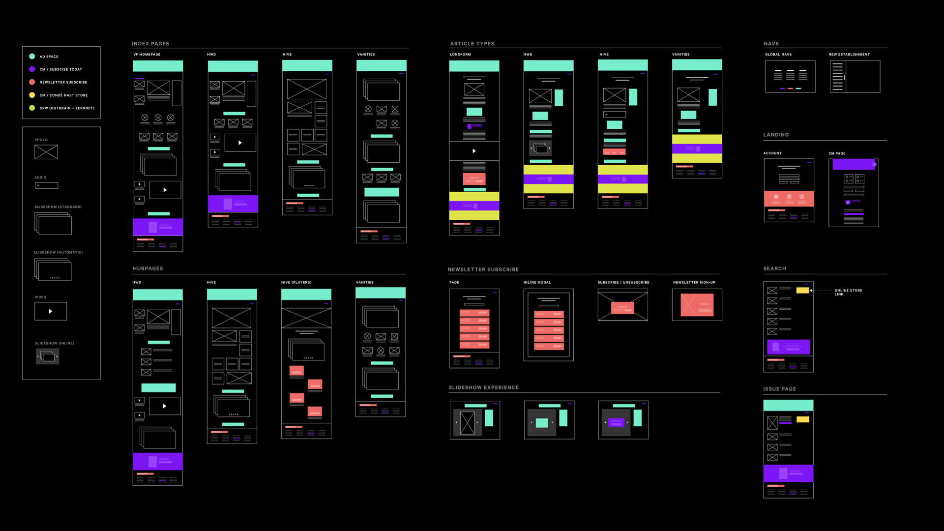
We established a set of modular components for the CM team to use across the website
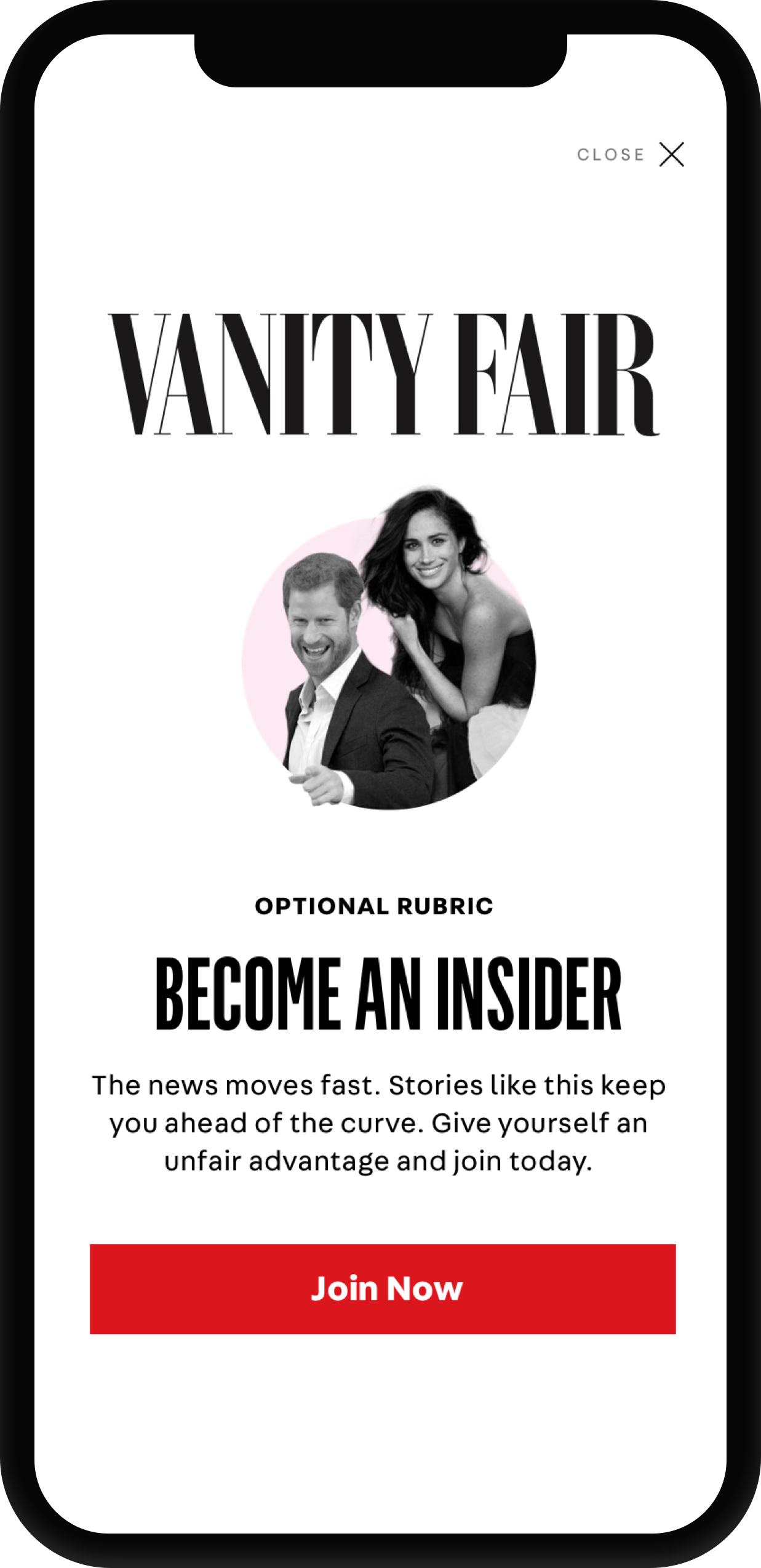
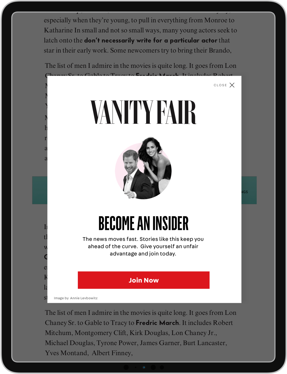
Interstitial
Disrupts the reading experience to showcase an important message.
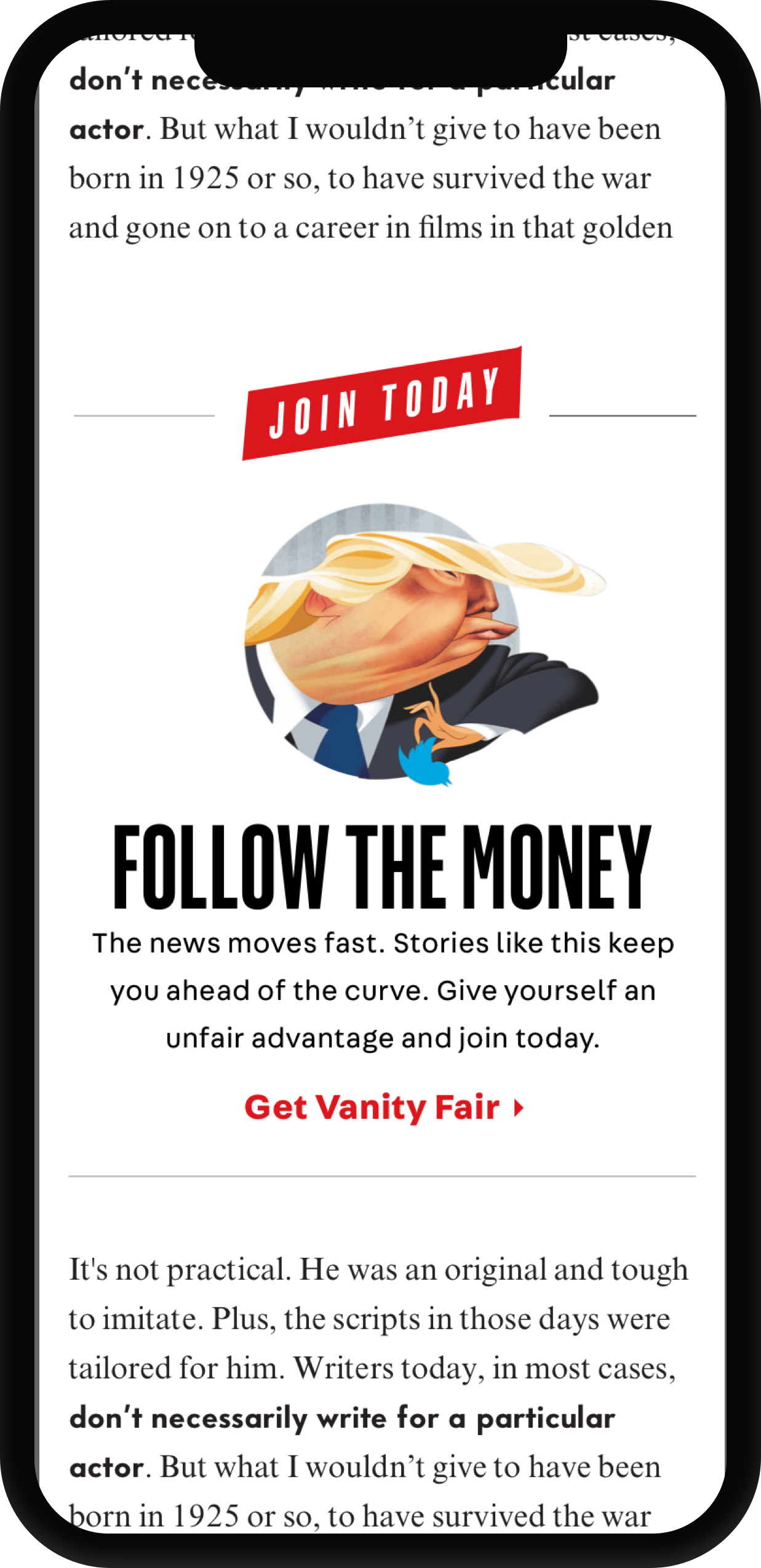
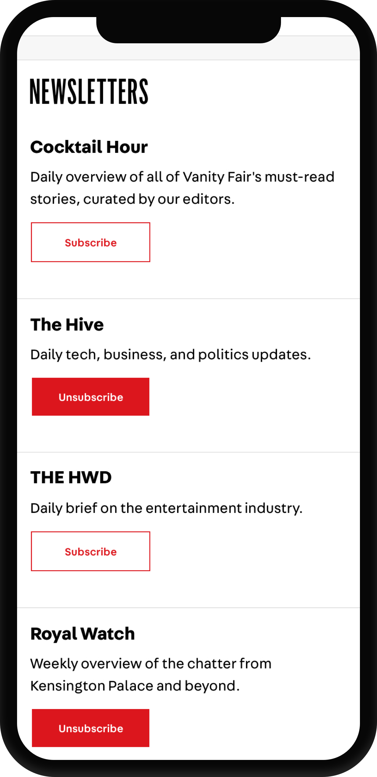
Inline
Messaging that is integrated into the native reading experience
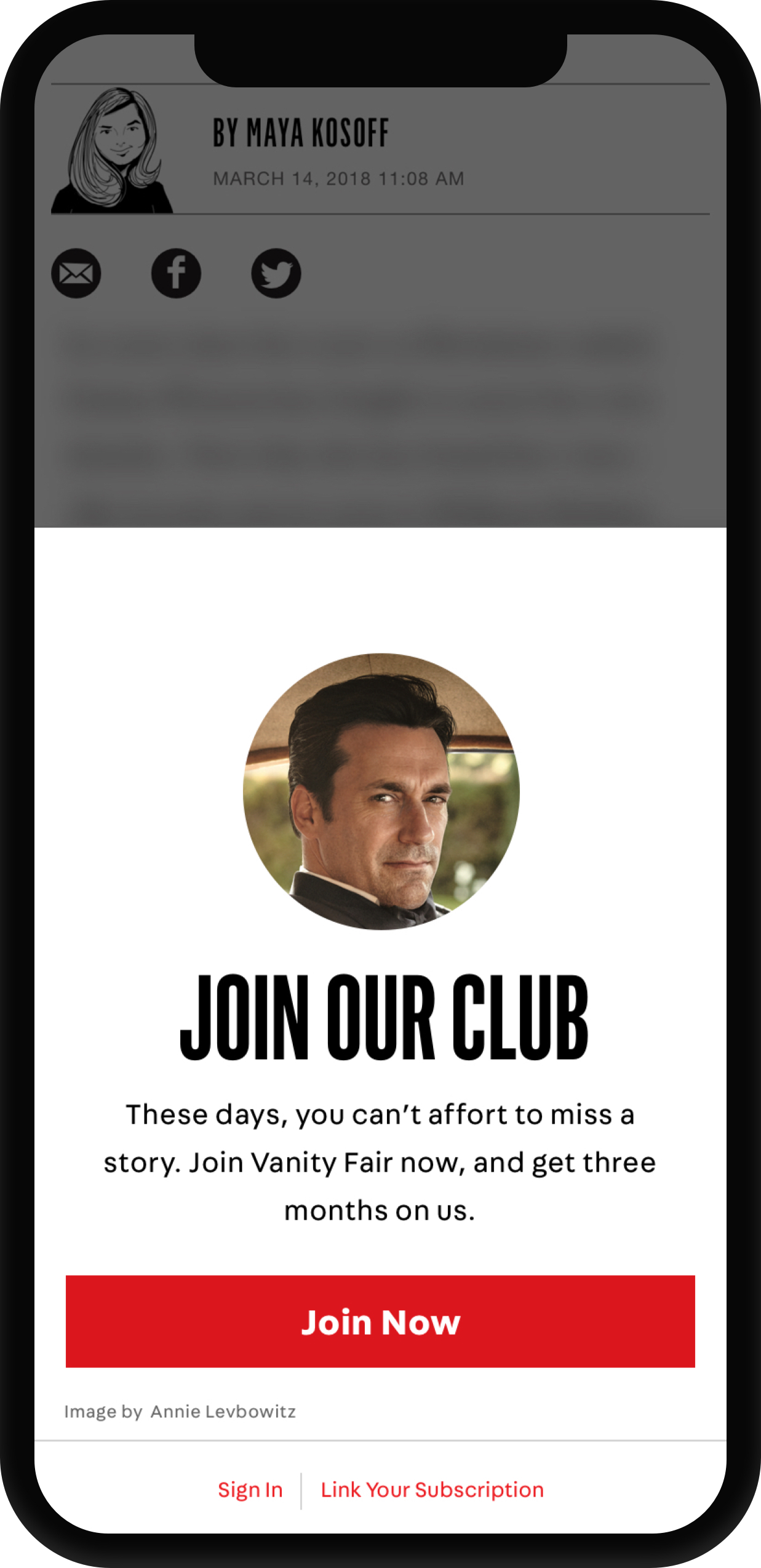
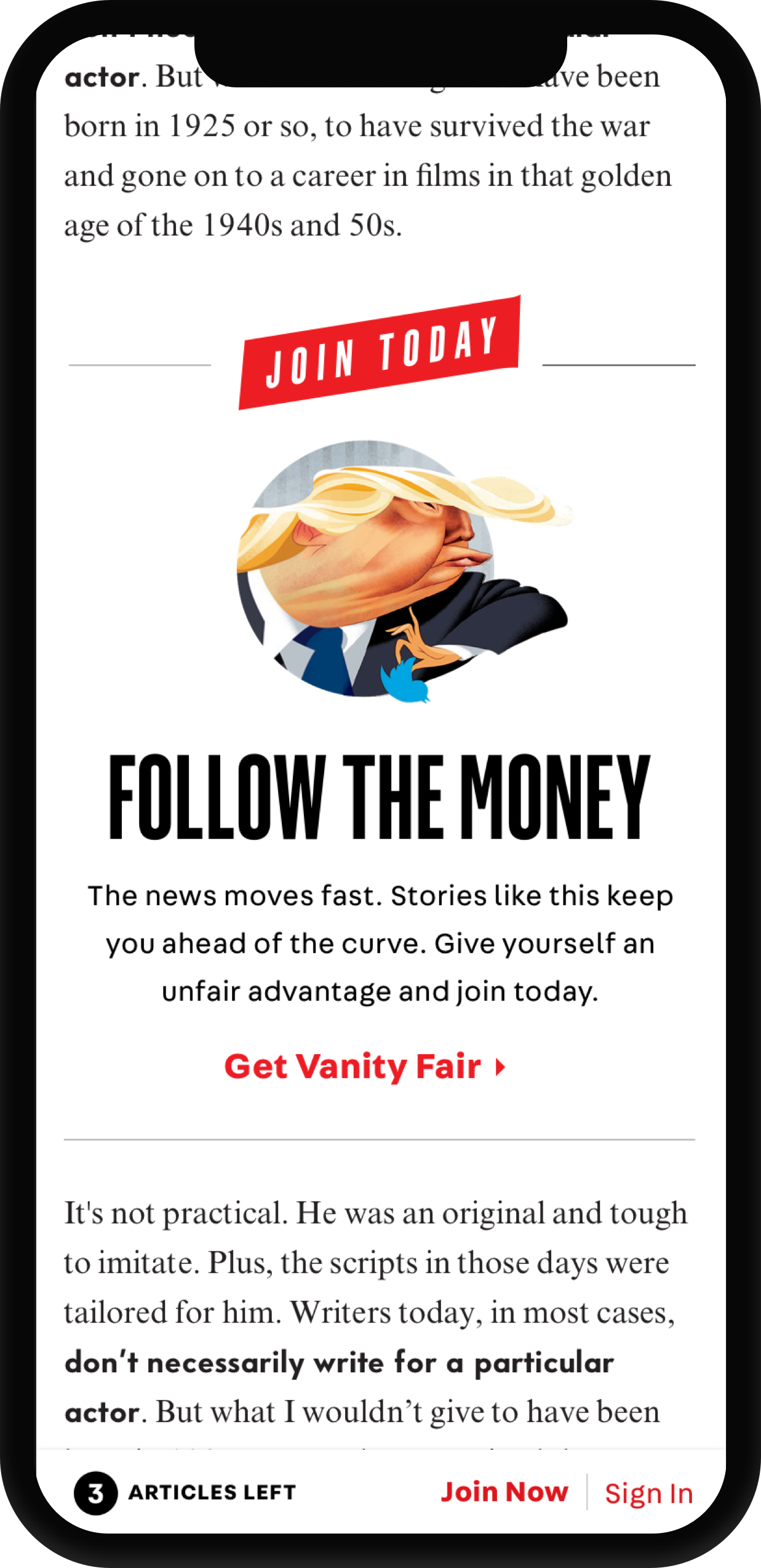
Barrier
Integrates the brand voice to soften a moment of painful friction.
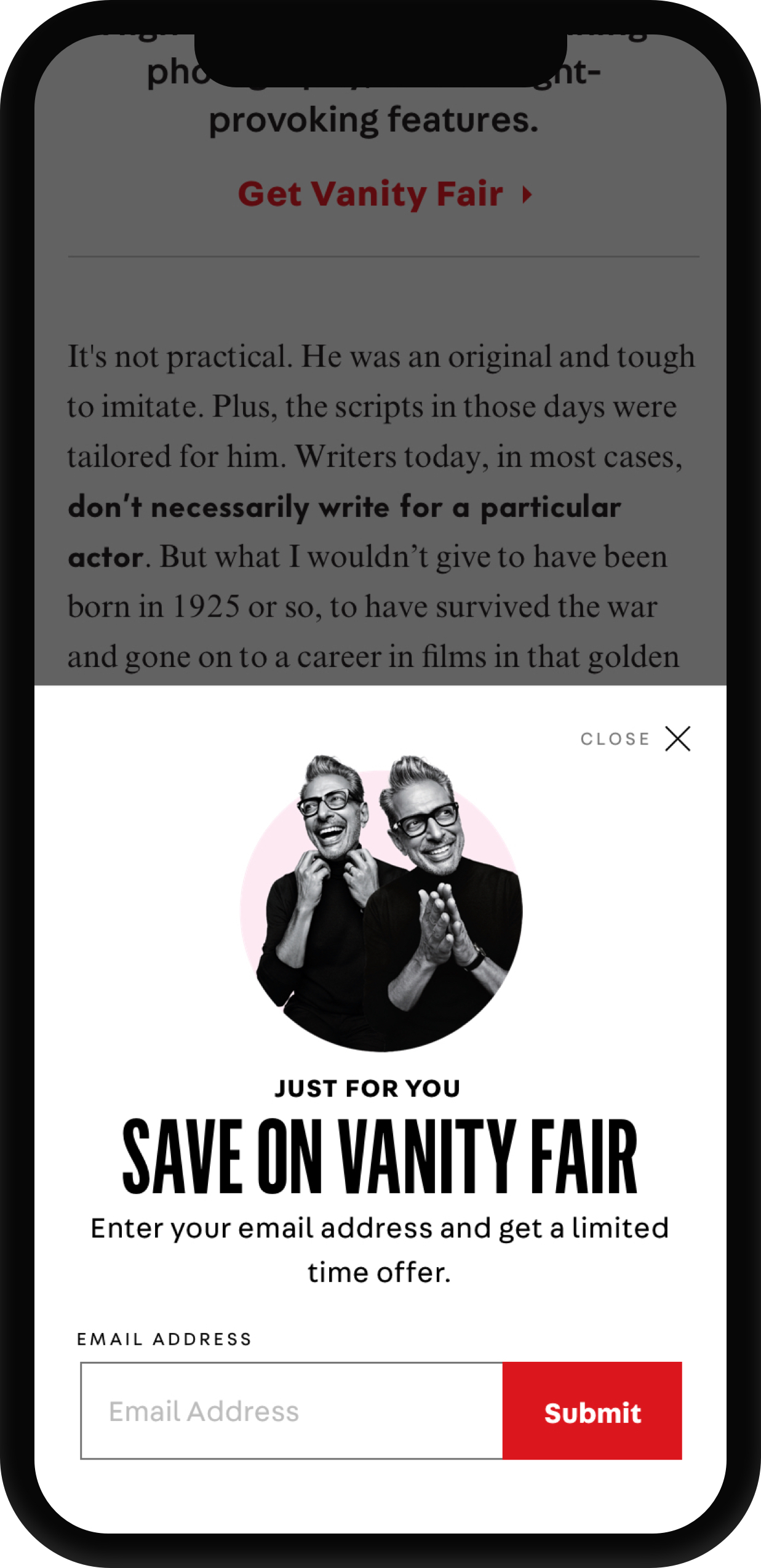
CM Riser
Integrates a targeted marketing message into article content.
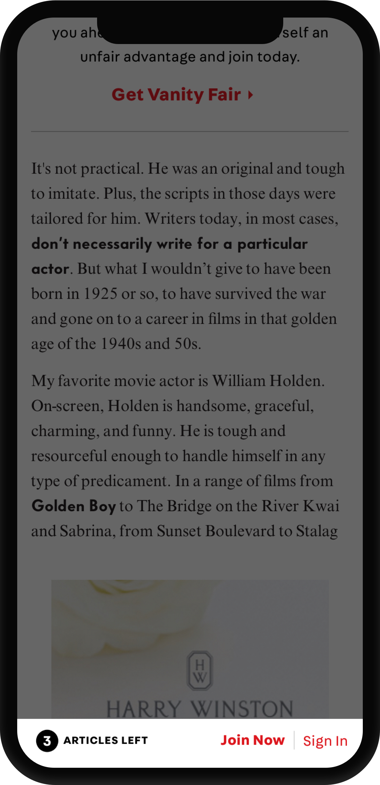
Growl Meter
Reminds the user that they’re consuming premium content.
Heading Unit
Acts as a marketing tool
Form Unit
Acts as a Utility Module
ORDER FORMS ARE OUTDATED AND CONFUSING
Simplify the order form.
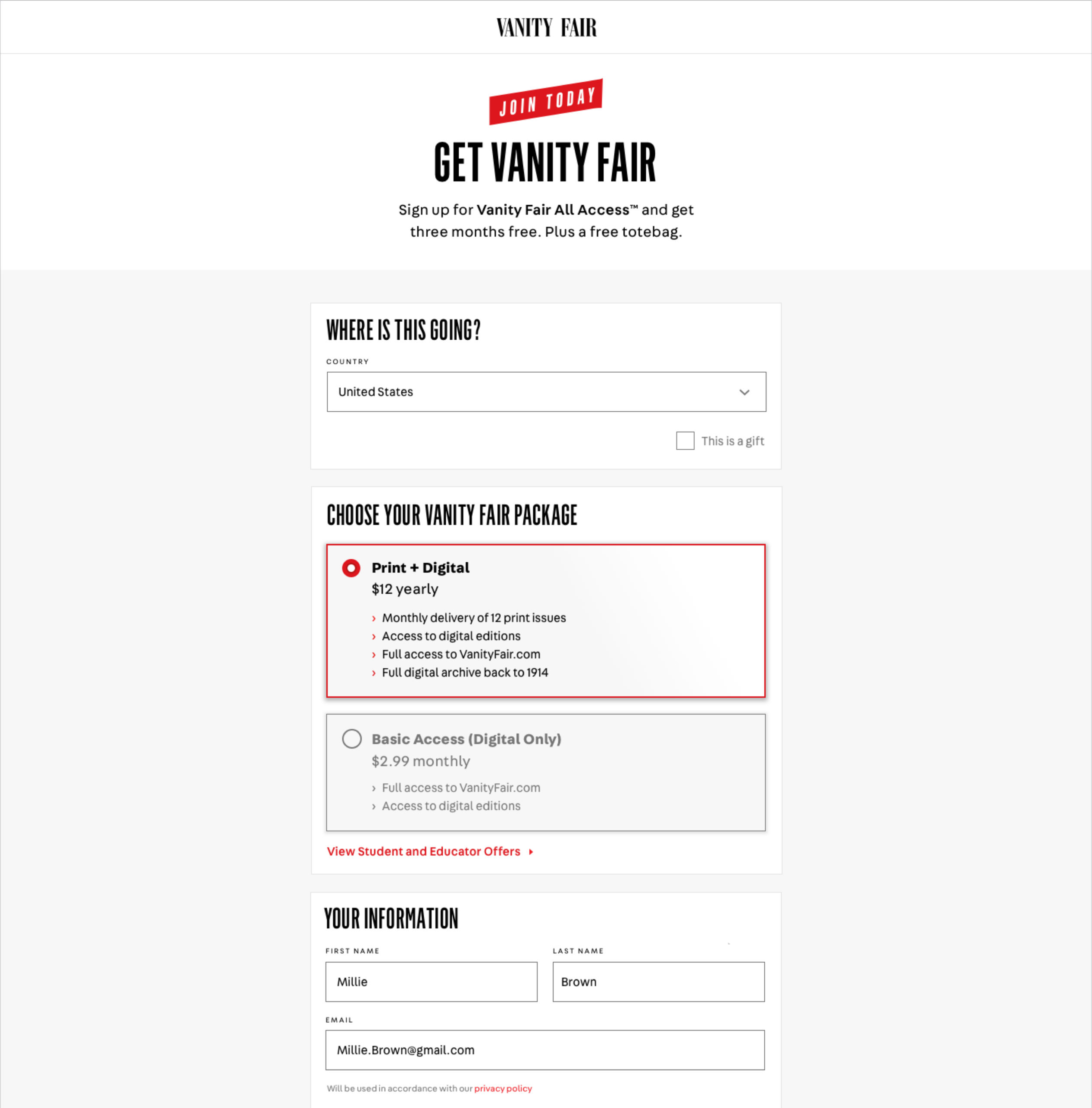
Potential Building Blocks
+ Flourish
+ Title(H1)
+ Subtitle
+ Dek
+ Brand Imagery
+ Title (H1)
+ Subtitle (H2)
+ H3
+ (Dek)
+ Body copy
+ Form Field
+ Subtext (i.e. Legal)
+ Checkbox/Radio selectors
+ Dropdown
+ Text Links
+ Button CTA
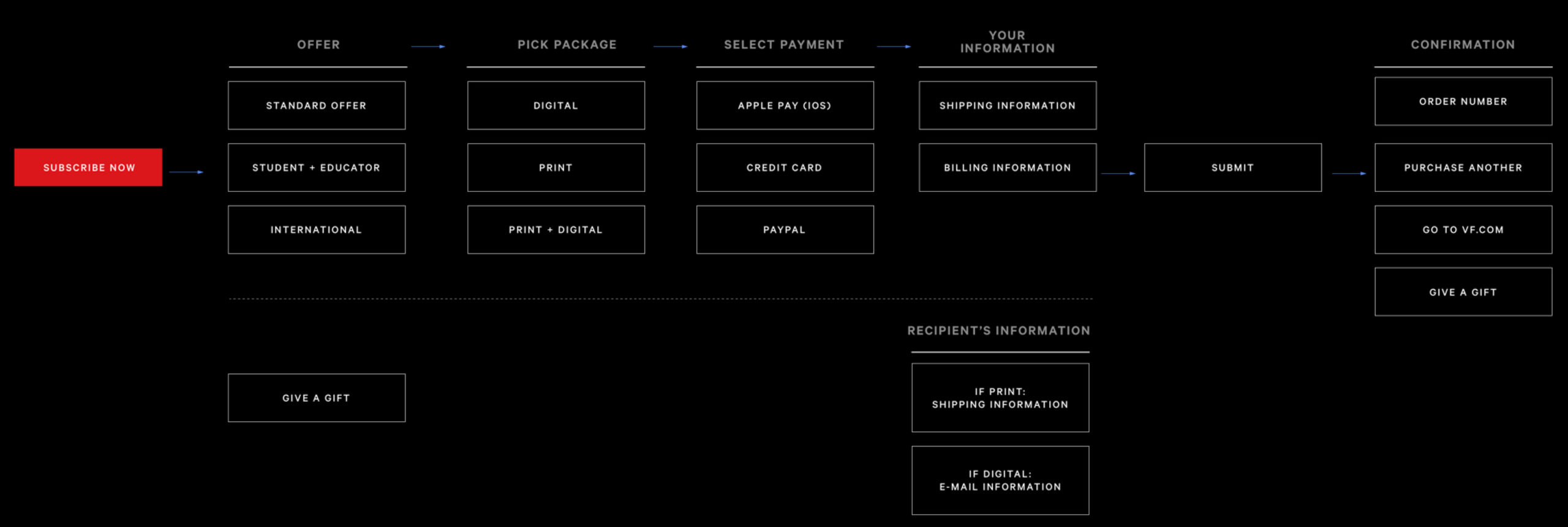
SUBSCRIPTION JOURNEY

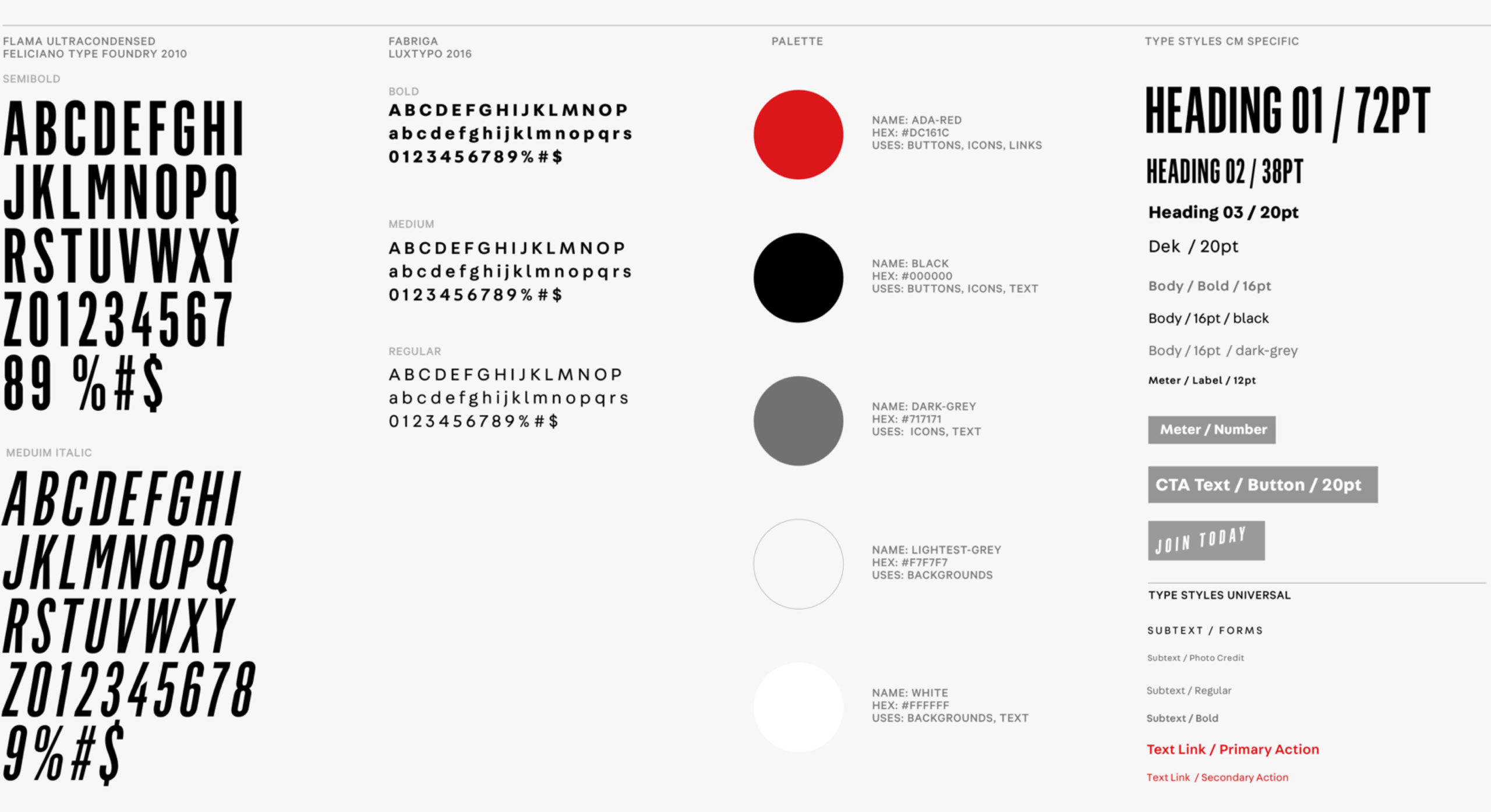
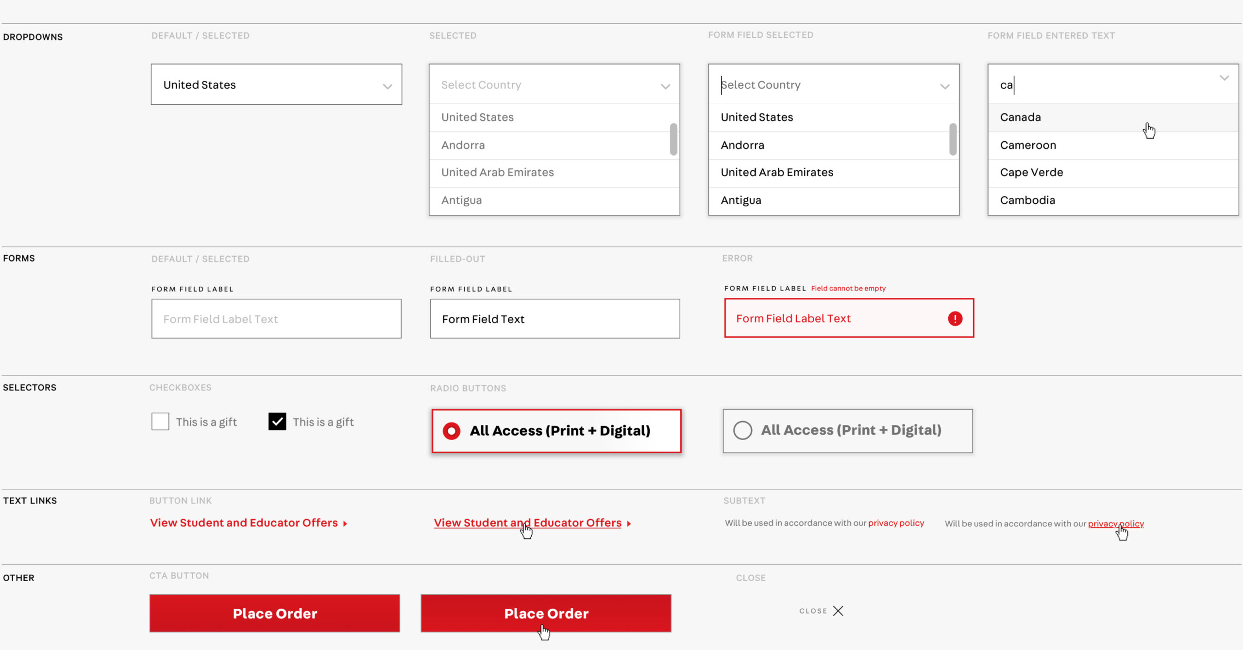
NO FOUNDATIONAL UI OR UTILITY STYLES ON THE SITE
Create cohesive Editorial and Utility design languages that amplify the Vanity Fair identity.
THE OUTCOME
404
First week, Average VF subscribers, up from a daily average of 44
594
First week, average Wired subscribers, up from 89.
50%
Brands desktop conversion rate.
75%
Brands Mobile conversion rate.